
Industry
Unified Cloud Communications
My Role
Product designer
Stack
Sketch, Figma, Zeplin, Miro
Unite was a modern, well-designed desktop app. The newly acquired Contact Center app (CCA) was a legacy product — outdated UI, different workflows, different mental model. The challenge was integrating both without breaking either.
I designed a unified experience where agents could handle regular business calls and contact center interactions from a single app — with clear visual distinctions so they always knew which type of call they were on.
200
45,000

How I split my time — heavily weighted toward research because the integration complexity had to be understood before anything could be designed.

Before designing anything, I mapped everything the CCA did — queue status, inbound calls, outbound calls, transfers, chats, and email — to understand what had to be integrated and what could be deferred.

I researched how Five9, 8x8, RingCentral, and Vonage handled the same integration challenge — looking specifically at how they distinguished contact center calls from regular calls, and how they handled the agent login flow.

I mapped two options: merge CCA into Unite, or redesign it as a standalone app. I presented the tradeoffs to stakeholders with pros and cons for each.
The decision: merge. One app, one experience, no context switching for agents.

The core challenge was positioning Contact Center functionality within an interface agents already knew. I introduced a new tab for accounts with CCA access — keeping the familiar Unite structure intact while making the new functionality immediately findable.

I audited every control in the existing Unite call bar and mapped each one against Contact Center needs — keeping what applied, removing what didn't, and adding what was missing. The result was a leaner, purpose-built call bar for CCA interactions.
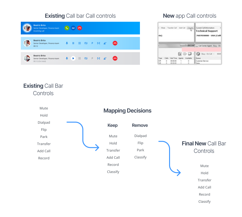
To help agents instantly distinguish a Contact Center call from a regular one, I changed the call bar colour to amber — familiar enough to feel native, distinct enough to be unmistakable.

The call bar had to reflect every state an agent might encounter — incoming, active, on hold, transferring, ending. I designed distinct colour and control states for each, so agents could read the situation at a glance without having to think.
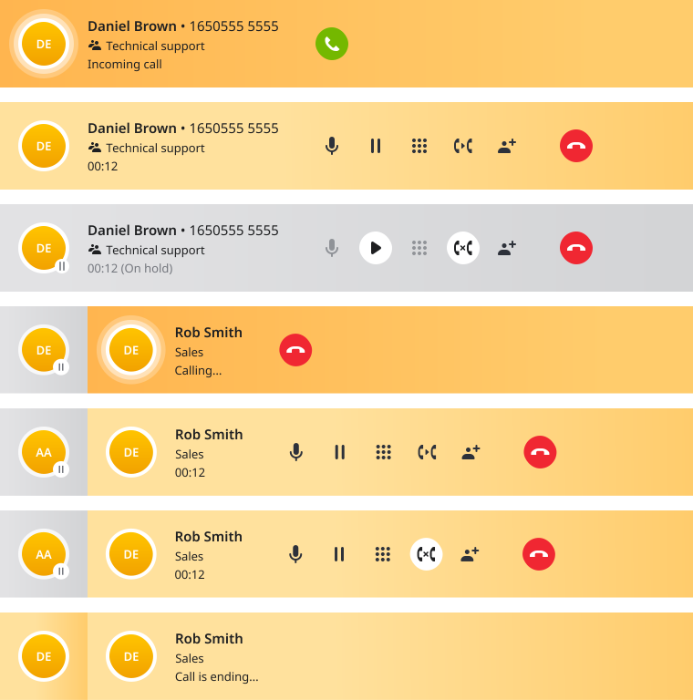
The transfer flow was the most complex interaction in the product — six distinct states from incoming call to completed transfer. I tested this first as it set the interaction pattern for everything that followed.

Most of the work happened between the wireframes and the final UI — aligning interaction behaviour with existing Unite patterns, building consistency into edge cases, and stress-testing every call scenario with the product team before the design system work began.
I was brought in to establish the foundation — the interaction model, visual language, and core flows. Once the groundwork was done, the project moved to a dedicated team.
Integration projects are behaviour problems before they're design problems. The hardest work was alignment, not aesthetics.