One foundation. Two architectures.

One foundation. Two architectures.

One foundation. Two architectures.

One shared token foundation, two completely separate component architectures for a web admin and a touchscreen tablet, built for a clinical operations platform for radiotherapy departments.

One shared token foundation, two completely separate component architectures for a web admin and a touchscreen tablet, built for a clinical operations platform for radiotherapy departments.

Role
Role

Founding Product Designer (0→1) · Co-founder

Products
Products

Admin web app + Clinical tablet

marketing site
marketing site

01 — Problem

Two products. Opposing needs.

Two products. Opposing needs.

Two products. Opposing needs.

Both products share tokens, but diverge at the architecture level.
I separated foundation from architecture:

Both products share tokens, but diverge at the architecture level. I separated foundation from architecture:

Admin — web application

Admin — web application

Context: managers at a desktop, reviewing audit logs, configuring roles, monitoring live machine states

Needs: density, many surfaces, scalability

Model: users move at their own pace

Context: managers at a desktop, reviewing audit logs, configuring roles, monitoring live machine states

Needs: density, many surfaces, scalability

Model: users move at their own pace

Tablet — clinical interface

Tablet — clinical interface

Context: hospital roles on a touchscreen inside a radiation controlled area during treatments

Needs: speed, clarity, zero ambiguity

Model: fixed flows, no errors tolerated

Context: hospital roles on a touchscreen inside a radiation controlled area during treatments

Needs: speed, clarity, zero ambiguity

Model: fixed flows, no errors tolerated

A single design system trying to serve both would over-engineer the tablet and under-engineer the admin. The solution was to separate what needs to be shared from what each product should own.

02 — Architecture

Share the foundation.
Diverge on everything else.

Share the foundation.
Diverge on everything else.

Share the foundation.
Diverge on everything else.

Shared: both products

  • Color tokens — colors.ts, used across both codebases

  • Color tokens — colors.ts, used across both codebases

Not shared: each product owns its own

  • Typography system

  • Spacing and layout tokens

  • Components

  • Architectural pattern

  • Typography system

  • Spacing and layout tokens

  • Components

  • Architectural pattern

WHY ONLY COLORS?

green700 means the same thing in both products — active, safe, confirmed. That meaning must be consistent. Typography, spacing, and components don't carry cross-product meaning. Forcing them to share adds constraint without adding value.

03 — Token examples

Flat. Named by scale. No layers.

Flat. Named by scale. No layers.

Flat. Named by scale. No layers.

One flat file. Named by hue and weight — green700 not primaryButton. The file describes what a color is. Each product's own layer handles what it means.

Why greens from tablet, grays from admin?

The two codebases drifted during independent development. Admin grays are rounder and cleaner (#333333 vs #303236). Tablet greens are richer and more saturated — better primary action color on both touch and desktop. One reconciliation pass. One source of truth.

The two codebases drifted during independent development. Admin grays are rounder and cleaner (#333333 vs #303236). Tablet greens are richer and more saturated — better primary action color on both touch and desktop. One reconciliation pass. One source of truth.

04 — Typography

Same typeface.
Different systems. Not shared.

Same typeface.
Different systems. Not shared.

Same typeface.
Different systems. Not shared.

Both use Inter. That's the only shared typography decision. Below that, each system is built for its context.

Tablet — atomic scale

xs · sm · md · lg · xl · xxl

xs

12px

sm

14px

md

16px

lg

18px

xl

20px

xxl

24px

Admin — semantic names

36 semantic → 15 core styles

font-page-title

22px · 600

font-modal-title

18px · 600

font-section-title

18px · 600

font-rca-card-title

16px · 500

font-body-heading

16px · 400

font-body

14px · 400

Why atomic on tablet?

Fixed flows, small screen, no ambiguity. The context tells you what size to use. lg for a heading, md for body. No system to learn, no wrong choice to make.

Why atomic on tablet?

Fixed flows, small screen, no ambiguity. The context tells you what size to use. lg for a heading, md for body. No system to learn, no wrong choice to make.

Why semantic on admin?

Many surfaces, many developers. font-page-title tells you where it belongs. xl doesn't. The naming makes consistency enforceable across dashboards, logs, and modals.

Why semantic on admin?

Many surfaces, many developers. font-page-title tells you where it belongs. xl doesn't. The naming makes consistency enforceable across dashboards, logs, and modals.

05 — Key decisions

The reasoning, not just the result.

The reasoning, not just the result.

The reasoning, not just the result.

Tablet uses tokens directly, no semantic layer

Architecture

Context

The tablet has a small, fixed set of critical flows , take responsibility, confirm PIN, update machine state. There's no ambiguity about what a color means in context.

The solution

A semantic layer like primaryAction → green700 adds indirection that slows debugging in high-stakes moments. Writing colors.green700 directly means any developer can read exactly what a component does , no layer-tracing required.

Hex values, not HSL

Color format

Why not HSL

HSL scales better. One hue value, change it and the entire scale shifts. Ideal for white-labelling or programmatic generation.

Why hex

The scale already existed from Figma. Hex is paste-anywhere, readable in any tool. HSL is great for brand personalisation or dark mode needs.

Built flat now, designed to grow later

Scalability

What exists today

One flat colors.ts. No abstraction, no layers. Comments explain intent inline. Copy-paste to both projects, nothing to learn or migrate. Simple enough that any developer picks it up in minutes.

What it enables later

Dark mode or white-labelling? Add a semantic export at the bottom of the same file. The flat layer never changes , components migrate gradually. The architecture doesn't close any doors, it just doesn't build for them prematurely.

06 — Components in context

Tokens become components.

Tokens become components.

Tokens become components.

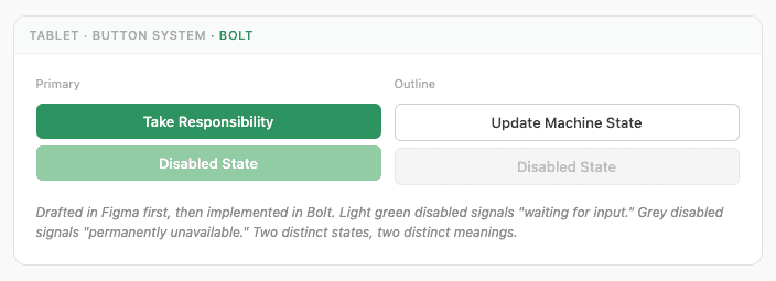
The token decisions above aren't abstract. They're visible in every component.
07 — My contribution

What I owned.

What I owned.

What I owned.

  • Token architecture
    Designed the flat shared file, reconciled two independently-built color systems, chose hex over HSL with documented rationale

  • Cross-product strategy
    Defined what to share and why, and explicitly what not to share, including the reasoning for each

  • Architectural divergence
    Semantic layer for admin, direct token usage for tablet, based on context not convention

Design systems should scale with product complexity, not enforce uniformity across products that have nothing in common except a brand.

Design systems should scale with product complexity, not enforce uniformity across products that have nothing in common except a brand.

AI FEATURE

AI ASSISTANT

How I scoped an AI panel to a hospital's own data, and closed a leak before it shipped.

See case study →

© Dimitra 2026

© Dimitra 2026

© Dimitra 2026

Create a free website with Framer, the website builder loved by startups, designers and agencies.