
Industry
Unified Cloud Communications
2020
Senior UX designer
Stack
Figma, Microstrategy
Many Partners had repeatedly requested a solution to measure the performance of Call Groups and analyze the traffic between callers and these groups. Without such tools, Managers struggled to understand call volumes and group efficiency in customer service.
To solve this, I designed a set of Dashboards. These dashboards provided simple, but clear insights into Call Group activity, including traffic trends and volume metrics, helping managers make data-driven decisions to improve operations.
~125,000
Customers interacting with Call Groups daily across multiple organizations.
10,000–15,000
Estimated number of call groups supporting key business functions.

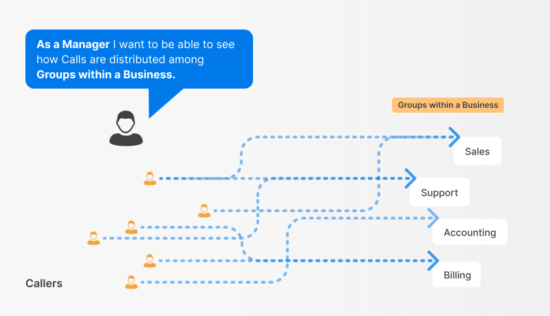
To understand what Partners meant, I made small visuals to understand the entities involved and how those could translate into possible dashboards.

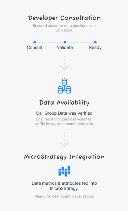
Before building dashboards, I had to consult with developers to ensure they had enough time to provide the necessary data.
We used MicroStrategy, which was one of the tools I had to learn to build dashboards with.
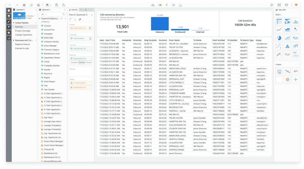
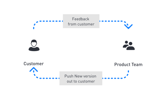
One of the advantages of using a visualization tool:
Being able to provide dashboards to customers quickly
Iterate several times to ensure all the requested metrics were included.
These are some of the features that were initially launched for the MVP. Features were added on gradually at a later date.


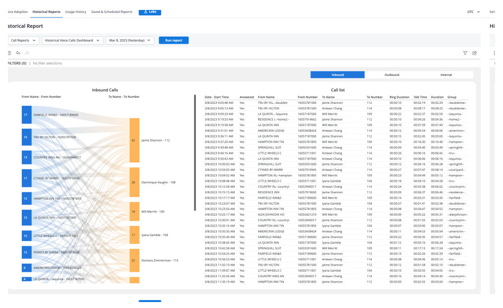
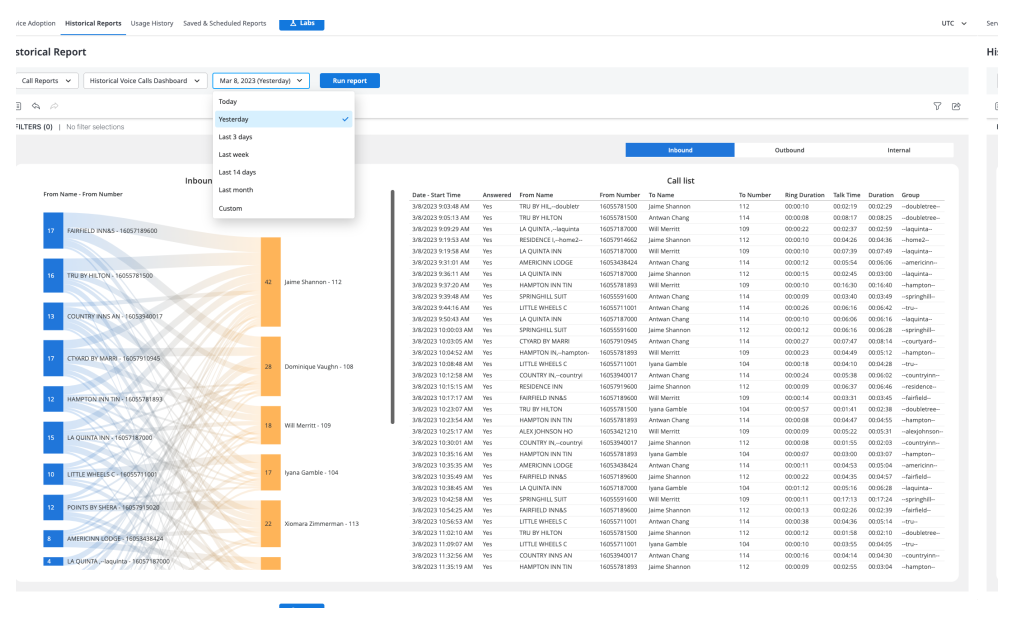

Understanding user needs when building dashboards is crucial to ensure metrics are accurate and effectively address specific business questions. In our case, we benefited from customers who had already provided detailed insights, giving us a solid foundation to work from.
One key lesson learned was the value of starting with a rough visualization. This approach allowed us to create a functional prototype without committing to major UI changes, enabling early feedback and iterative improvements. However, the visualization tool posed challenges, particularly in connecting dashboards efficiently and offering limited flexibility for UI adjustments. This experience highlighted the importance of selecting the right tools for the job and remaining agile in adapting to technical constraints while prioritizing user needs.