
Industry
Customer Experience
2023
Lead UX designer
Stack
Figma, Figjam, Craft, Jira
I conducted a UX audit on an existing product to uncover usability issues and align the experience with business goals.
Backed by CEO input, Pendo data, and user interviews, this audit highlighted key friction points and opportunities for improvement.
250
30
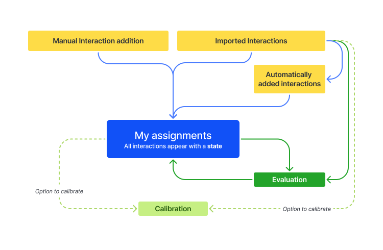
To understand where friction might live, I began by mapping the end-to-end user journey across all interaction entry points. This exposed inconsistencies, drop-off risks, and complexity that could affect key business metrics.
The data at each entry point helped identify underused pathways, suggesting misalignment between feature value and user behavior.

To assess the evaluation experience and identify UX challenges, I combined multiple research inputs:
30 qualitative user interviews (team leaders + evaluators)
Behavioral data analysis via Pendo
Strategic alignment through discussions with the CEO
UX flow mapping and heuristic evaluation
Based on observed user behavior and interview data, I hypothesized that the complexity of interaction input methods was leading to decision paralysis and reduced engagement with key workflows.
Do these 2 pages need to be separate?

Over 10 days, I interviewed 30 users — mainly team leaders and evaluators — to understand how they use the "Contacts to Evaluate" and "Completed Evaluations" pages. Through 7 core questions, I uncovered 3 recurring pain points that impact efficiency and task clarity.

The user interviews uncovered valuable insights. These recommendations aim to streamline workflows, increase visibility, and build trust in the evaluation process.
Frequent switching between “Contacts to Evaluate” and “Completed Evaluations” pages
Interrupts user flow and increases cognitive load
Evaluations occasionally “disappear” from view in the Contacts list
Users lose track of tasks, reducing trust in the system
“Completed Evaluations” page is underused or ignored
Low engagement, users miss important review insights
Based on the audit findings, I proposed a simplified interaction flow and redesigned the evaluation experience to reduce friction, increase visibility, and align with user mental models.
Consolidating entry points into a single "My Assignments" view reduces context switching and allows users to focus on interaction status rather than location.
This mockup introduces a unified workspace with a powerful filtering system, allowing users to easily access evaluations based on progress or status — eliminating the need to bounce between separate views.

While this audit wasn’t implemented, it brought clarity to misalignments in user workflow and product structure. It laid the groundwork for future product evolution and deepened my practice of connecting user behavior, business priorities, and system design.